FLY Mór - UX
DESKTOP
Project Overview
This project involved designing a website for Fly Mór, a fictional start-up airline. The goal was to create a fast, intuitive, and user-friendly online experience built on a deep understanding of the company’s target users. This work was completed as part of the Professional Diploma in UX Design with the UX Design Institute.
My Contributions
I was solely responsible for every stage of this project, from user research to UX design. The focus was on understanding user needs and ensuring the usability and efficiency of the final product. In a real-world context, this UX foundation would then be handed over to UI designers and developers for implementation.
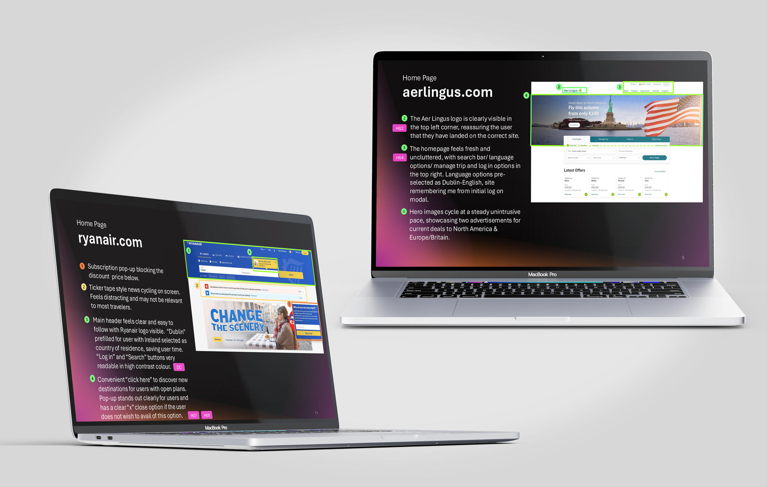
RESEARCH - Competitive Benchmark
Introduction
This competitive benchmark analysed the flight booking processes of four best-in-class websites, identifying strengths and improvement areas. How do they solve the problems we are trying to solve? What design conventions and best practices do they follow that Fly Mór should adopt?
The airlines/aggregator sites under the microscope were Aerlingus, Ryanair, Skyscanner & Air France.
Key take aways
All sites aim to simplify booking with geodata-driven location pre-fill and clear search tools. However, Ryanair’s cluttered homepage and intrusive pop-ups hinder usability. Aer Lingus and Skyscanner shine with intuitive, flexible date selection, while Ryanair lacks group booking and fluid navigation.
Flight details and alternative dates are easy to compare, though Air France sometimes hides fare details below the fold. Ryanair highlights carbon offsetting and charity options more prominently than competitors. Air France and Skyscanner use strong visuals and clickable breadcrumbs to enhance navigation and convey a premium feel, unlike Ryanair’s ad-heavy, less polished experience.
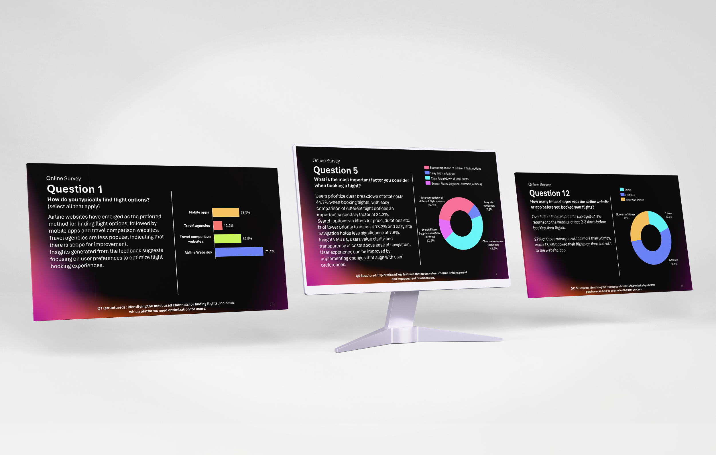
RESEARCH - online survey
Introduction
An online survey was conducted from 24–26 September 2024 via Google Forms and distributed through WhatsApp, engaging 38 participants. Featuring 13–15 structured, unstructured, and Likert-scale questions, the survey aimed to identify potential customers, understand user experiences with airline websites and apps, and determine the most frequently used platforms and reasons behind user preferences. It also sought to uncover common tasks, goals, and frustrations, providing valuable qualitative and quantitative insights to guide future product development.
Key take aways
The majority of respondents accessed airline websites or apps via smartphones, typically booking flights a few times per year. Airline websites were preferred over apps, with Aer Lingus and Ryanair emerging as the top choices. Users’ preferences were mainly influenced by cost, brand affinity, and destination options.
The data highlights a strong inclination toward leisure travel and over half of users revisited sites 2–3 times before booking—primarily for price comparisons and research. Most users successfully completed their intended tasks, while others delayed bookings to continue exploring flight options.
Areas for Improvement:
o User Experience: Reduce pop-ups, improve price tracking, and remember user preferences.
o Transparency: Clarify additional fees and costs.
o Search Filters: Simplify flight searches and enhance flexibility for users.
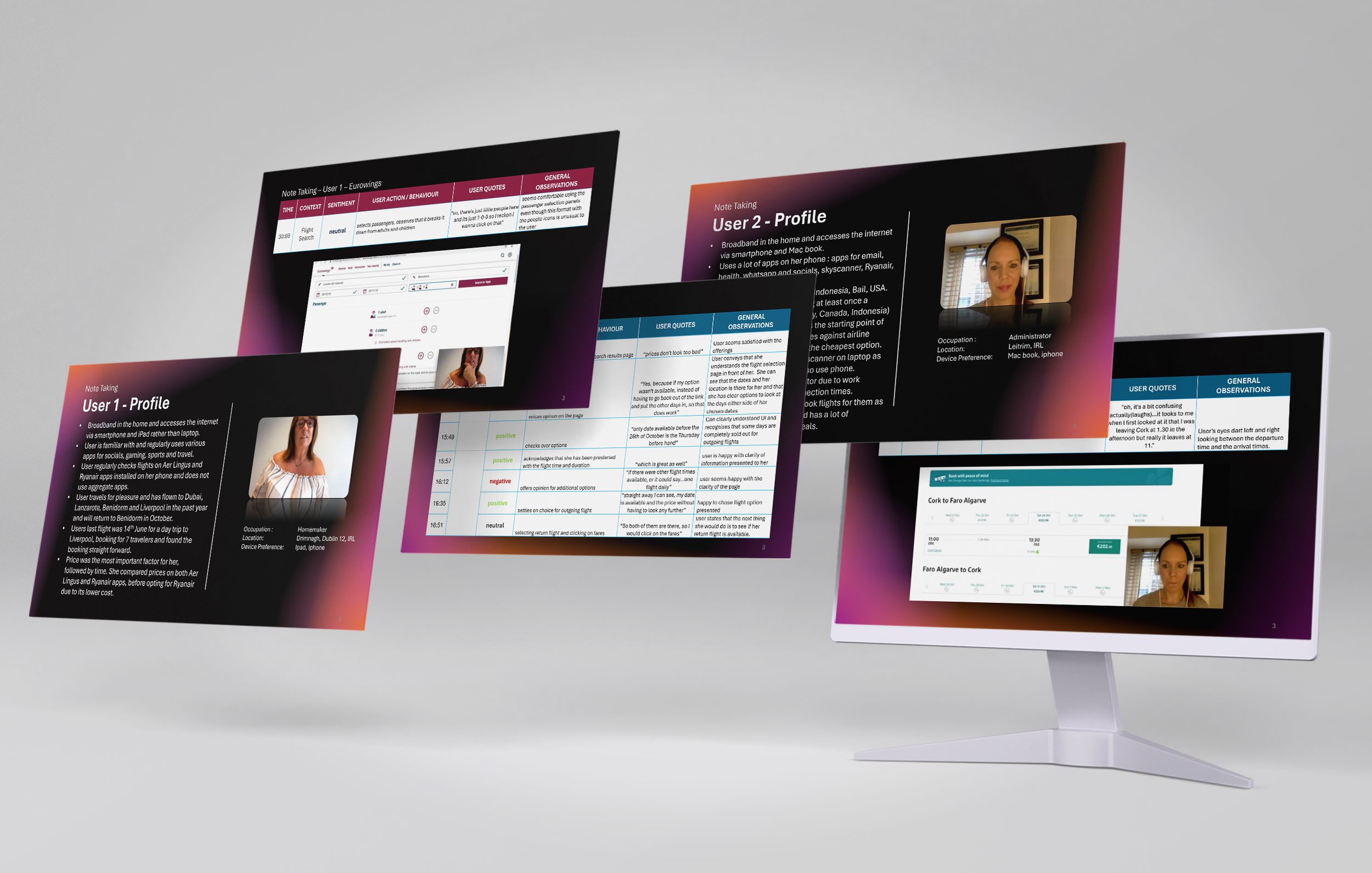
RESEARCH - Usability testing
Introduction
As Fly Mór is a conceptual website developed from scratch, this phase of research focused on analyzing competitor platforms to inform its design. I conducted independent usability tests on Aer Lingus and Eurowings, and reviewed two additional tests carried out prior to my research, resulting in a total of three participants and four airline websites evaluated.
Each usability session included an in-depth pre-test interview to understand participants’ goals, prior booking experiences, and common frustrations. During the test, I observed users’ interactions to uncover their mental models, behaviors, and pain points throughout the booking process.
Key take aways
o Information Overload: Many sites presented excessive or irrelevant details, overwhelming users.
o Lack of Clarity: Certain features and options were confusing or poorly explained.
o Pricing Confusion: Users were often unsure whether displayed prices applied to one passenger or multiple travelers.
o Complex Booking Flow: The overall booking journey felt cumbersome and difficult to navigate.
These insights highlight the need for clearer design, simplified navigation, and transparent pricing to create a smoother, more intuitive user experience for Fly Mór.
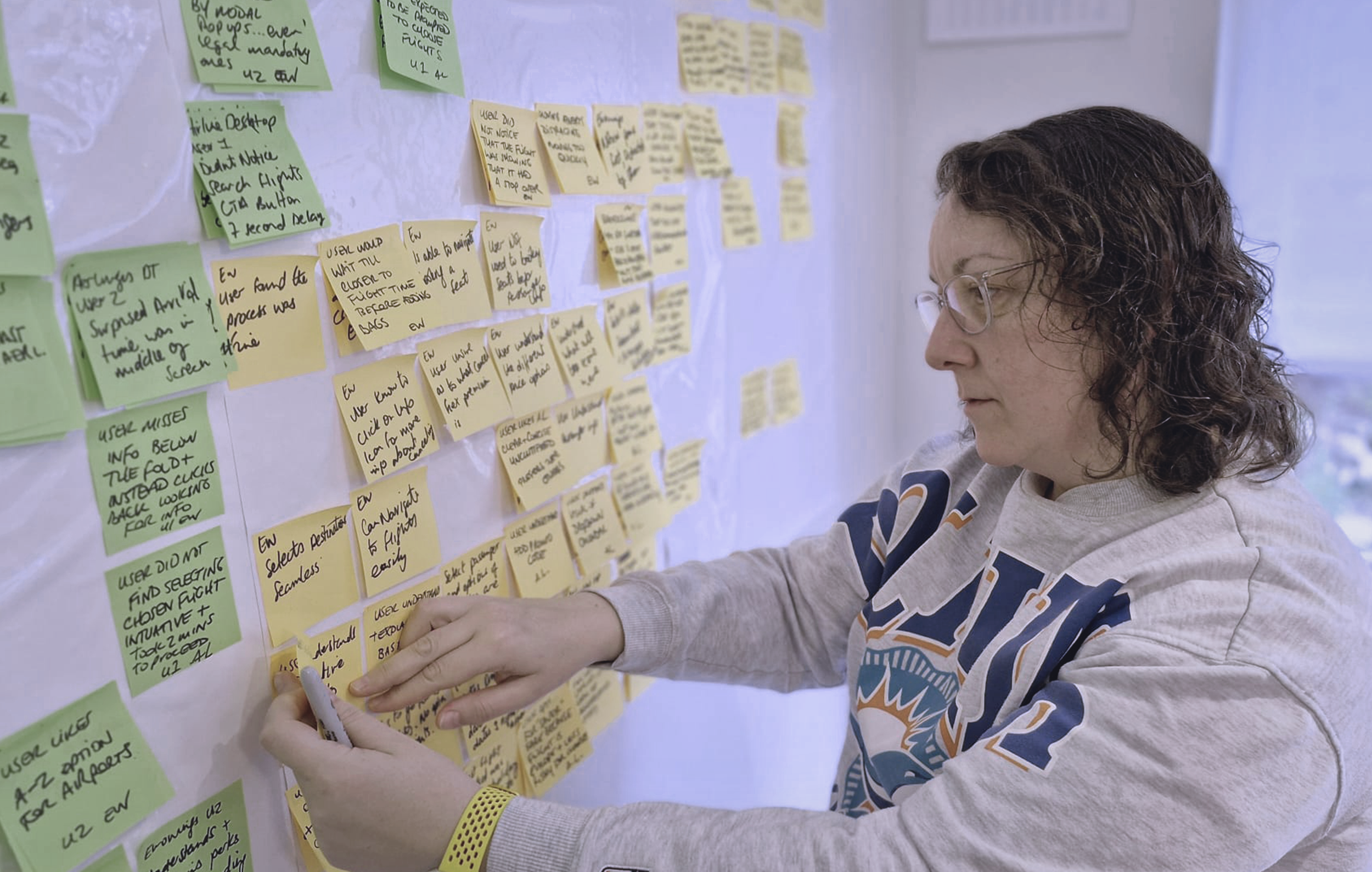
Analysis - affinity diagram
Introduction
This stage focused on collating and analyzing data from the research phase — including competitive benchmarking, online surveys, and usability tests. Given the largely qualitative nature of the data, I used an affinity diagram to organize insights logically and identify emerging themes. Each key finding was captured on post-it notes and grouped into categories such as:
- Navigation
- Breadcrumbs
- Website remembers
- Flight preferences users
- Prices and fares
- Affinity/mental model
- Upselling
- Calendar / match system + real world
- Overall systems unclear/issues
Through this process, clear patterns and potential solutions began to surface, many of which could be readily applied in the design phase.
Key take aways
o Design should remain clean, intuitive, and visually engaging.
o Display only relevant information at each stage of the booking process.
o Provide clear explanations for additional features or options.
o Ensure full cost transparency throughout the user journey.
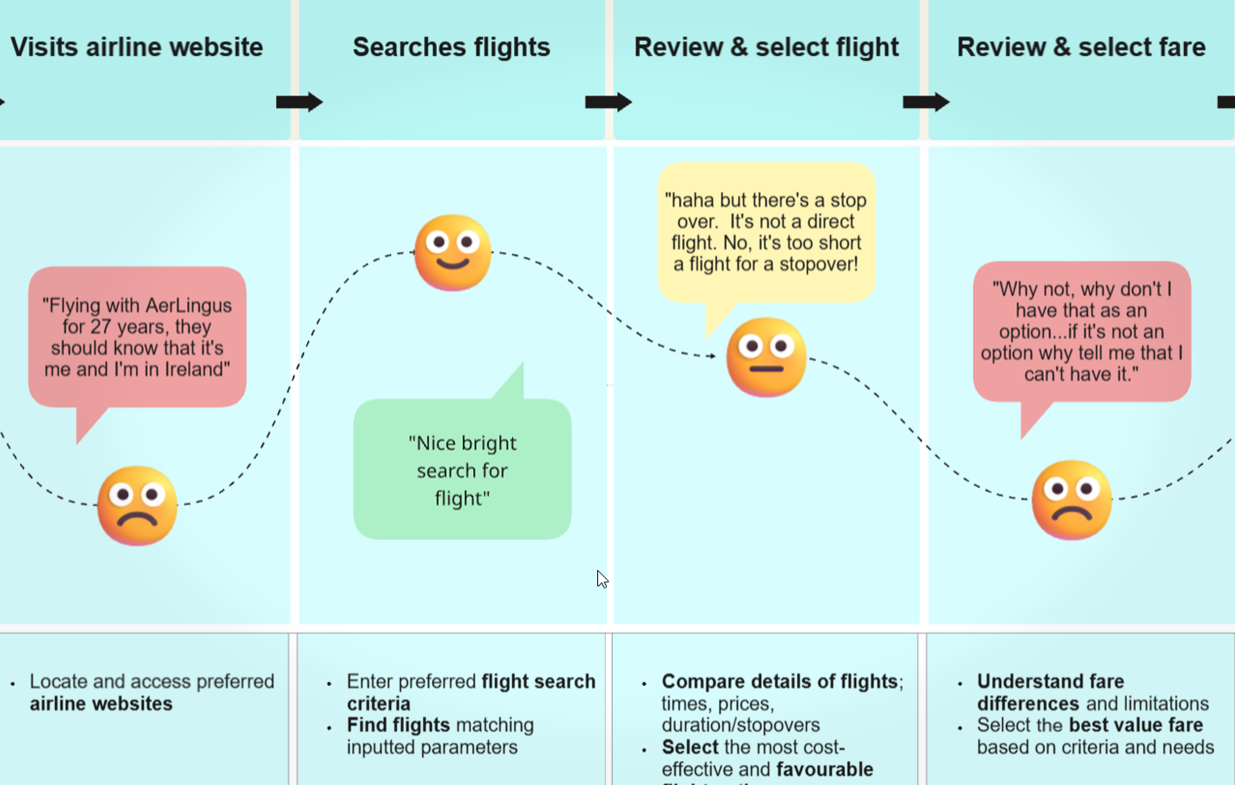
Analysis - customer journey map
Introduction
This visual mapping of the average user journey, developed from my research findings, provided deep insight into each stage of the flight booking process. By consolidating all data, I was able to analyze every step of the journey to identify how Fly Mór could deliver a more seamless and user-centered experience. Each stage explored users’ goals, behaviors, actions, mental models, positives, pain points, and opportunities. To further illustrate these insights, direct quotes from usability tests were incorporated to capture authentic user sentiments.
Key take aways
The analysis revealed that users encountered friction across multiple touchpoints, with the flight search and selection process emerging as the most challenging and frustrating stage. These insights will directly inform the core focus areas for designing a more intuitive and efficient Fly Mór booking experience.
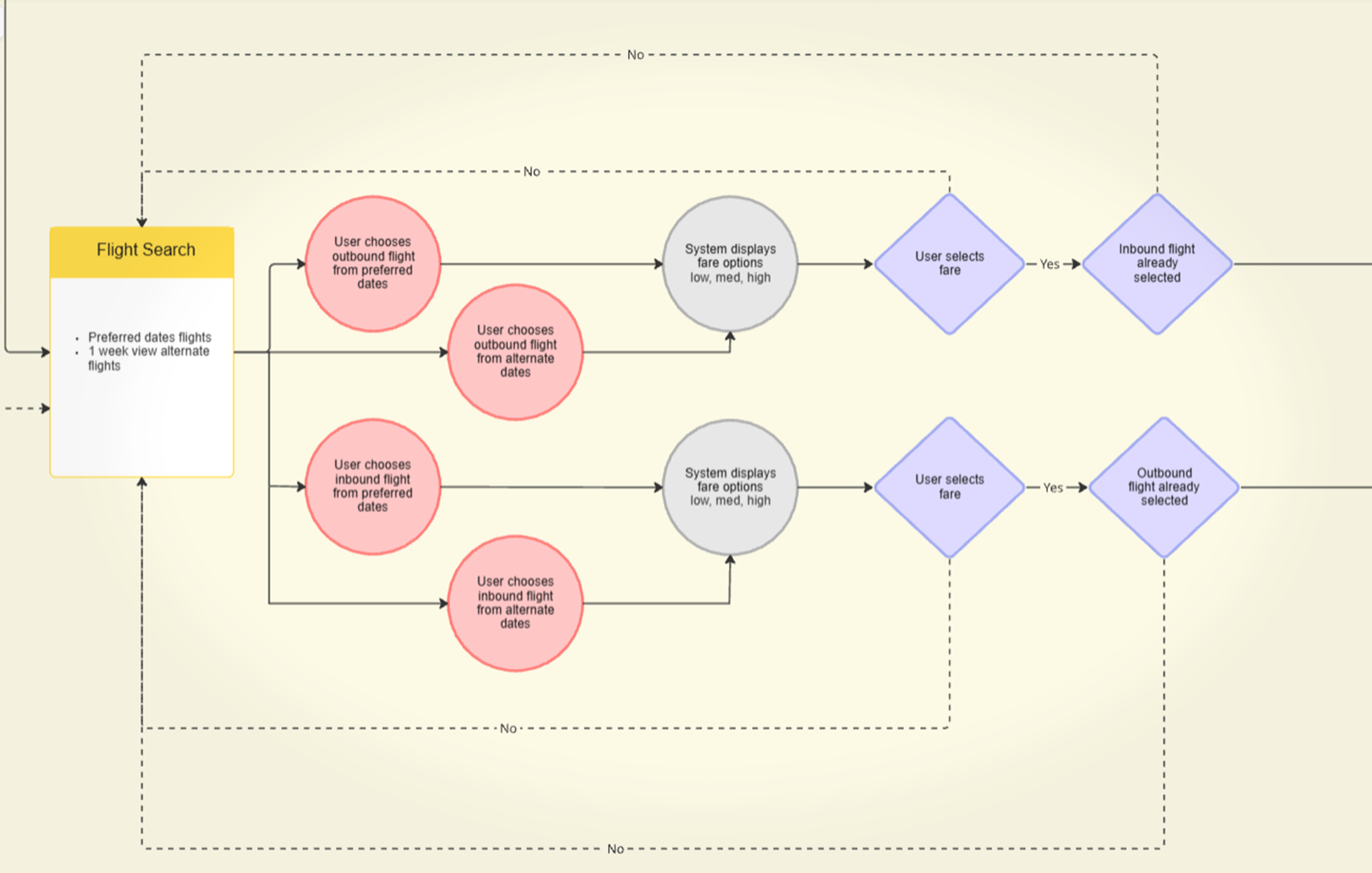
Design - Flow diagram
Introduction
The flow diagram resolved key user pain points identified in the customer journey map and affinity diagram. In this early design phase, I mapped the user’s ‘happy path’ through the Fly Mór website—from the homepage to the booking summary—with the goal of creating a seamless, intuitive, and frictionless experience.
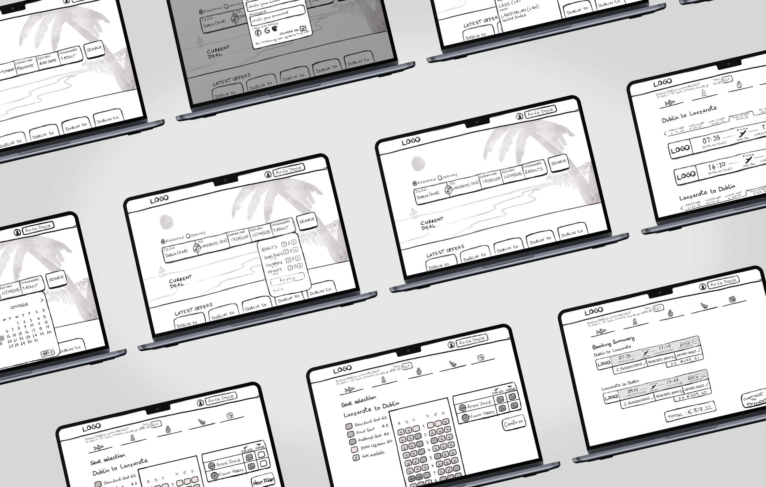
Design - interaction design sketches
Introduction
Building on the flow diagram, I designed detailed screen layouts and states to illustrate the user’s ‘happy path’ through the Fly Mór desktop app, ensuring that the design effectively addresses key user goals and resolves issues uncovered during research and analysis.
Screen states sketched:
- Home page
- Flight search
- Passenger info
- Baggage & extras
- Seat selection
- Booking confirmation
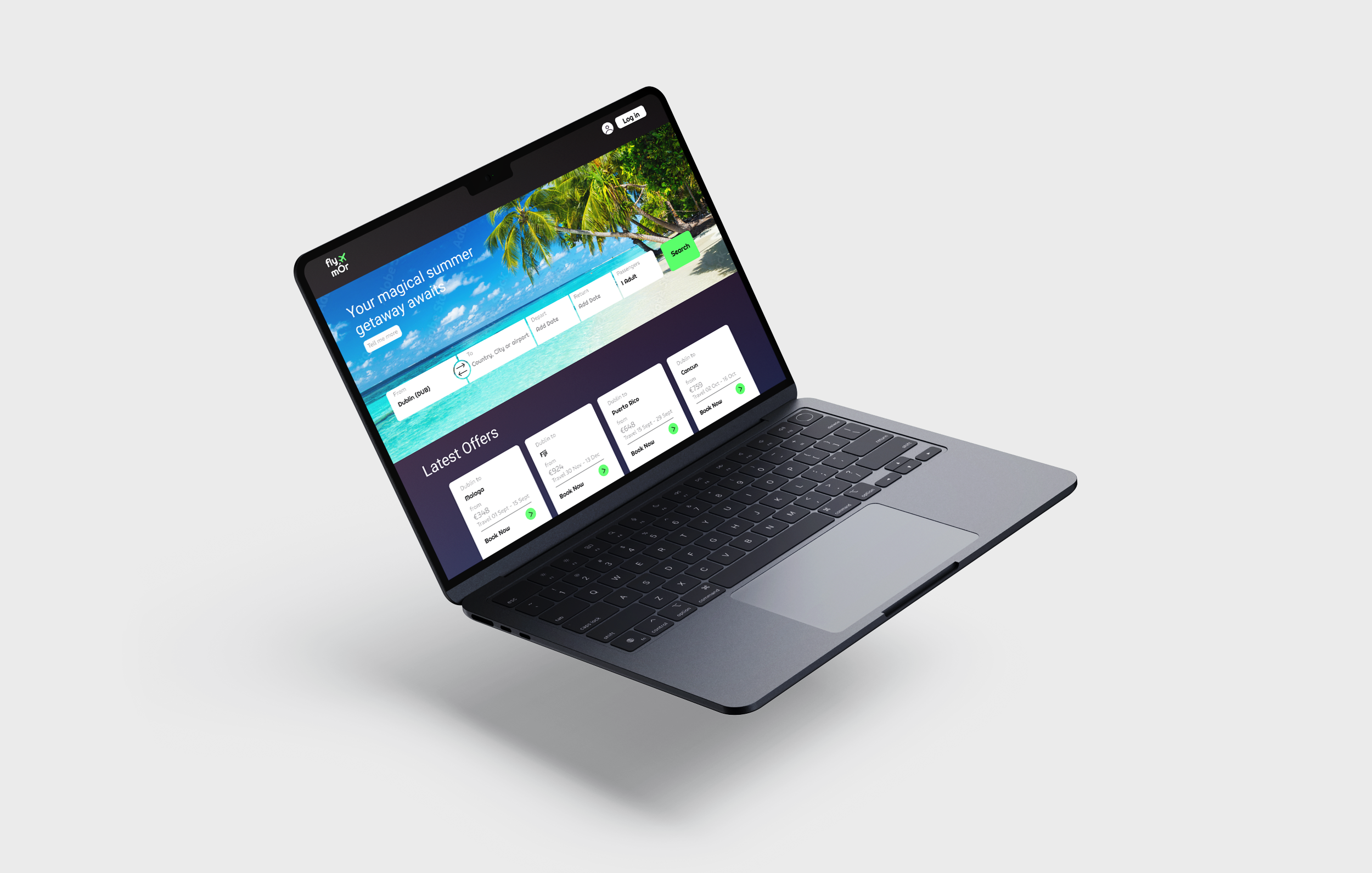
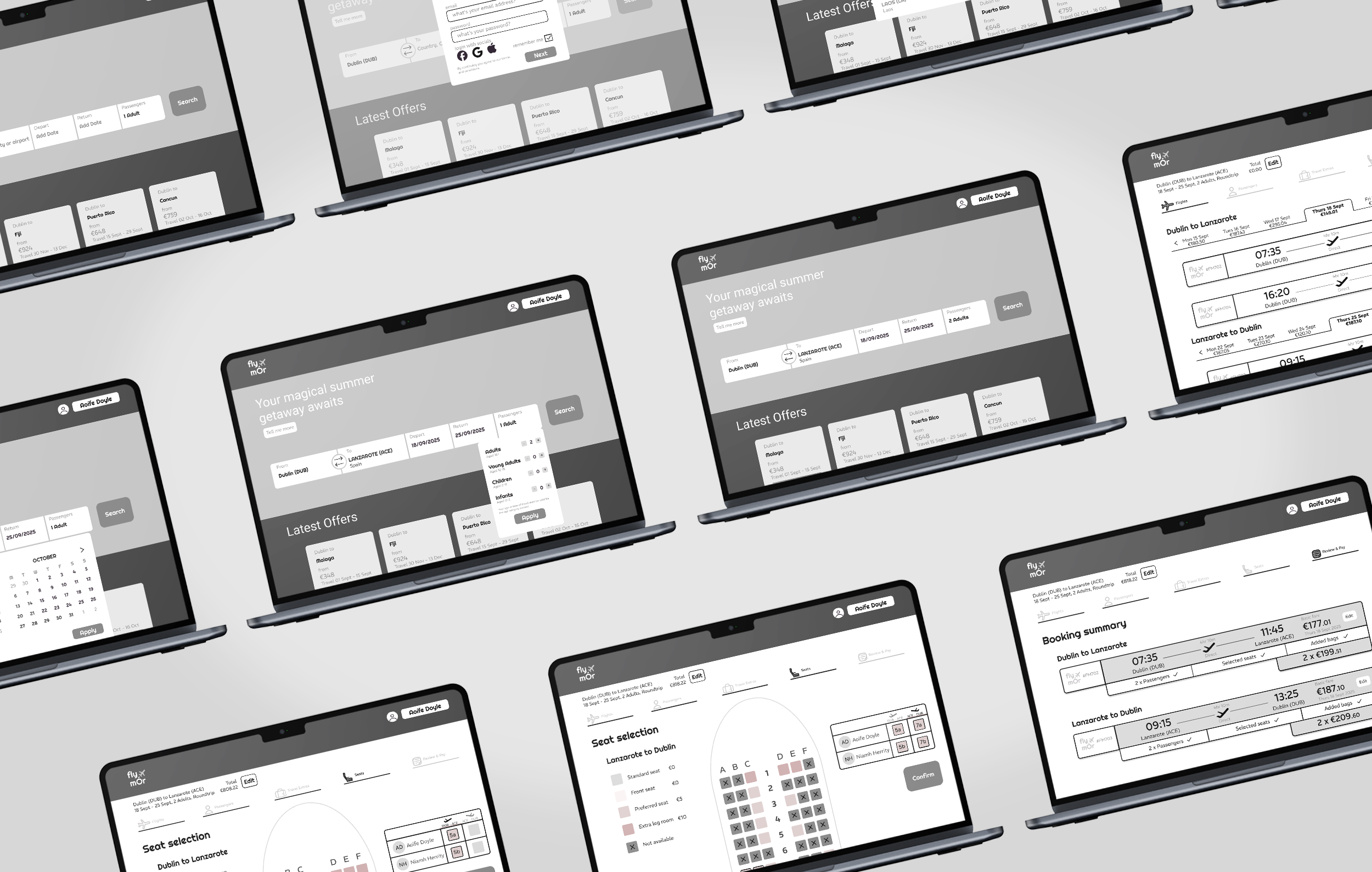
Design - Prototype
Introduction
With the groundwork laid, I moved into the prototyping phase. Creating a medium-fidelity prototype derived from my interaction sketches, I focused on refining the user’s ‘happy path’ through the website. Through successive rounds of user testing, I was able to validate core design decisions and identify areas for improvement before bringing interactions to life and generating meaningful user insights.
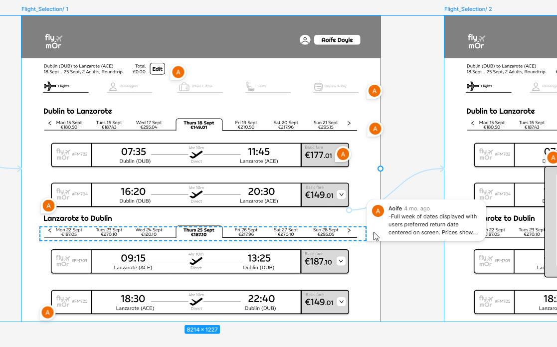
Design - wireframe
Introduction
Lastly, to ensure a smooth transition from design to development, I produced a comprehensive annotated wireframe. Each page, screen state, and component was carefully detailed to communicate user experience decisions, providing developers and UI designers with clear guidance and eliminating uncertainty.